Jeanius App
The Brief
When shopping for jeans online, it is hard to compare between different styles and it is hard to know for sure how they will fit. How can we help women to select the style of jeans they’re looking for in the right size?
Create an app tailored to address the challenges encountered when shopping for jeans online in the UK market. The target demographic consists of females aged 16 to 50, primarily high street shoppers, spanning diverse body types. The app should prioritize inclusivity and feature a user-friendly interface suitable for individuals with an average level of technical proficiency.
Target Audience
- People who identify as female
- Females between 16 and 50 years old
- Females of a diverse span of body types
- Females of an average level of technical savviness
- Females who would shop online for jeans
- Females who are based within the UK
- High street shoppers
User research
For this project, I conducted qualitative research, starting with guerilla research on a bustling high street in central London. I approached people randomly and asked them to take an anonymous survey about their experiences shopping for women’s jeans online. Link to survey I made sure to gather data from a diverse range of women with regard to age, height, and body type. This survey helped me identify common problems like fit, style options, sizing inconsistencies, and the lack of body representation. One major issue I found was the inconsistency in sizing across different brands.
Engaging with shoppers face-to-face helped me understand their frustrations and challenges better, which guided my design decisions to be more user-centered. 59% of the women said that they sometimes return jeans purchased online, and almost 30% said that they always do. Data was gathered on what factors women consider when looking for jeans online, as well as which retailers are most popular. This information helped me choose a relevant competitor for comparison.
The findings from the survey informed the development of more focused interview questions for the next stage of research. I reached out to family, friends and samples who completed the survey that were willing to do an interview. Once again, diversity in sample selection was considered.
Check out the below link where you can view bar charts and pie charts that present the findings of the research.
Interviews
The secondary stage of the research was a face to face interview. Attached is the link to the questions that were prepared for the interviews, as well as the note taking sheet that was used to record data. Jenius App Interview. The aims of the interviews were as follows –
1.Identify User Pain Points:
Understand the specific challenges and frustrations that women face when shopping for jeans online. What improvements are needed?
2.Understand User Preferences:
Learn about the style preferences that women look for.
3.Gather Insights on Sizing and Fit:
Gain insights into the common issues they encounter with sizing and fit when shopping for jeans online.
4.Identify and assess retailer apps, as well as competing solutions:
Determine which brands or retailers users trust and prefer when buying jeans online. Understand the factors influencing their choices. For apps that provide a solution already -what they like or dislike about these solutions?
5.Collect Feedback on App Features:
Explore the elements and features that would make users trust and use the app. What features, tools, or information users would find most valuable.
6.Assess the Role of Personalization:
Understand how important personalization is in helping users find jeans that match their style and fit their body type.
Job statements and user personas
Using insights gathered from the qualitative research, I developed job statements and user personas crucial for the user-centered design approach. This involved distilling information collected from surveys and interviews to understand the needs and frustrations of the target audience. Job statements outlined the tasks and goals users aim to achieve when shopping for women’s jeans online, while user personas provided a tangible representation of the diverse demographic segments.
These artifacts served as practical tools to guide my design efforts, ensuring that the solutions align closely with the real-world needs and behaviors of the users.
Competitor analysis
Surprisingly, there was no awareness of any apps that have attempted to offer a solution to this age old problem. Samples mentioned retailer sites that do a good job at helping them to find what they are looking for. I did some research online and came across two apps that have attempted to offer solutions. Ms Tyler helps women to find clothing of any kind, while Like a Glove is specifically designed for jeans. A retailer that proved to be very popular when carrying out the guerilla research was Levis. For this reason, I decided to analyze the app of this retailer.
By dissecting the features, user experience, and overall strategies employed by the competitors, I gained valuable insights that informed my design decisions. It enabled me to identify gaps and opportunities in the market. By pinpointing the areas where the competitors were lacking or where user needs are not adequately addressed, I saw an opportunity for Jeanius to fill in the gaps. Not only did this activity reveal opportunities for improvement, it also provided inspiration for some of the solutions that I created.
Summary of main requirements
- A personalized experience that makes women feel like they can find a pair of jeans tailored to their body type
- Detailed and honest reviews from other female shoppers
- Time efficiency
- Intuitive UI
- Better filtering options when searching for jeans
- Personal recommendations based on fit and style trends
Proposed solutions
I explored various solutions aimed at providing users with a personalized experience, empowering them to discover jeans tailored to their unique body types. During my research, I came across the Ms Tyler app, which served as a valuable source of inspiration. This app acts as a fashion community for women with similar body types, where users can share outfit images and fashion ideas. Reflecting on this concept, I sought to adapt and expand it to aid women in online jeans shopping. Recognizing the significance of personalization and peer reviews from my research, I integrated these elements into my solution.
In the app, women can create accounts and input their body dimensions, including waist size, hip size, inseam length, and weight. This information is securely stored, and to prioritize privacy, users can choose to use a random username and are not required to upload a picture of their face. Instead, they can upload full-length body images wearing form-fitting clothing to visually represent their stature and body frame. Once registered, users can create reviews of jeans they have purchased online, including links to the retailer sites.
The app functions by allowing users to conduct filtered searches for desired jeans. Search results display jean reviews submitted by women with similar body types. To aid users in assessing the reliability of these reviews, the displayed reviews are determined by how closely the contributor’s body type matches that of the user searching for jeans. This compatibility is assessed through a percentage comparison of the data entered upon sign-up. This method enhances the likelihood that the jeans will fit the user’s body.
If a user finds a pair of jeans they like, they can view the contributor’s account for additional details and comparisons. Access to full body images of individuals can instill greater confidence in the match, as it provides a visual representation of body proportions that numerical data alone cannot convey. Users can also choose to match with contributors who share similar body types, enabling access to future reviews from these individuals. Additionally, users can like or favorite jeans to save them for future reference within the app.
Overall, the app comprises four main sections: user profiles, search functionality, saved/favorite items, and a section dedicated to storing and displaying all matches. This structure streamlines the online jeans shopping experience, empowering women to find jeans that fit and flatter their unique bodies confidently.
I started planning the basic layouts of the app with some low fidelity wireframe sketches that I drew on paper. After this, I started to explore colour schemes, fonts, and how I would establish an identity for the app. Below I will talk you through the design decisions behind what I created.
User profile section
I strived to create a simple UI that would be intuitive for users of lower technical savviness. I thought that it would be useful to have the most important information displayed at the top of the user profile – age, height, weight etc. This is likely the information that the user would be searching for at first glance. Beneath this follows the more specific body dimensions which have been displayed visually to enhance a better visualization of the person’s body dimensions. To avoid the clumsiness of opening new pages, and the user becoming lost on the app, I decided to create three tabs for measurements, photos, and contributions, which would be displayed on the same page upon tapping on them.

Search function
Throughout the user research, the importance of effective search filtering was emphasized. I conducted a thorough examination of how various retailers implement filtering options and compiled a list of those that would be most beneficial for users. To streamline the user experience, sub-categories are organized in a collapsible accordion format, ensuring a clutter-free interface. Detailed lists of sub-categories per category can be accessed via comments on the Figma file. I chose a 2-column layout over a single column to prevent excessive scrolling, as a single column proved too lengthy. Once users select the relevant sub-categories for their search, they can collapse the accordion and proceed to the next category. To aid users in recalling their selections, a list of chosen sub-categories is displayed in small text, eliminating the need to reopen the accordion. This approach optimizes usability and efficiency, enhancing the overall search experience for users.

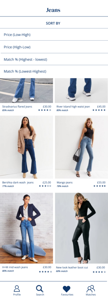
Results
I opted for a layout commonly found in many retailer apps for the results page. At the page’s top, users can customize the layout to their preference, choosing between single, two, or three columns. They also have the option to sort results by price and match percentage. The match and star ratings are displayed below the main image to provide users with a quick overview of how the jeans might fit and appeal to them. This eliminates the need for users to select each item to view it, read the entire review, and then return to the results page, thus prioritizing time efficiency.
Review example
At the top of each review, you’ll find images of the reviewer wearing the jeans. To indicate multiple images are available, I’ve included icons at the bottom of the main image for easy scrolling. For user convenience, the like/favorite icon is positioned on the bottom right, ensuring easy selection with the right thumb while holding the phone. Initially, I placed it on the top right, but this proved to be too cumbersome. Upon saving/favoriting the jeans, the heart will turn from white to red.
Users can view the reviewer’s account to assess the match, while a link to purchase the jeans is provided near the top. This allows users to quickly access the jeans on the retailer’s site before delving into the review. This also saves the user time in the event that the jeans are not available in their size.
To ensure detailed reviews, reviewers are required to provide specific product details, some of which align with the app’s filtering options. For example, waist and leg length may not be applicable if the jeans were purchased in a UK size 12, but I included them to accommodate retailers who size their jeans differently.
The review is broken down into product-specific features important to women, based on research findings. I opted for a slider design, allowing reviewers to provide more accurate feedback. This approach enables reviewers to demonstrate the range to which certain answers apply, providing a more honest and effective method of reviewing, particularly when certain specifications are challenging to quantify definitively.
The home page would consist of recent reviews submitted by peers which are compiled in one place. The user can scroll through these reviews to seek inspiration and stay on trend.

Fonts
Choosing the right font pair was crucial in creating a cohesive and visually appealing user experience. I used Google fonts to search for possible font pairs. Some of the fonts that I was considering can be seen on the prototype figma file. I wanted to use a serif and sans serif font. In the end, I chose DM Serif Display and Open Sans. Together they create a harmonious balance between sophistication and modernity. DM Serif Display exudes elegance and sophistication with its classic serif style. This font brings a sense of refinement to the app, which aligns perfectly with the fashion-focused nature of the platform. On the other hand, Open Sans offers excellent readability and versatility. As a sans-serif font, it provides a clean and modern look that complements the classic elegance of DM Serif Display. Open Sans is highly legible even at smaller sizes, ensuring that all text throughout the app remains easy to read and user-friendly.
.
Colour scheme
In selecting a color scheme, I looked at the color schemes being used on cognate and non cognate apps. I created color palettes from these and tried to implement them on this app. I felt that none of them were really suitable for the nature of this app.
In the end, I selected a color scheme that reflects the product that the user is searching for. With this in mind, I chose light blue and navy to represent denim. With white as the dominant color, light blue and navy are used to create visual segmentation between different sections.
White serves as the canvas for the app, providing a clean and modern backdrop that allows the other colors to shine. Light blue is used to add a touch of softness and tranquility to the interface. This gentle hue conveys a sense of calmness and reliability, without overwhelming the user. Meanwhile, navy is reserved mostly for text font, providing a strong contrast against the predominantly white background. Its deep and bold appearance commands attention and ensures readability, guiding users through the app effortlessly.
.
Conclusion
In conclusion, the app has successfully addressed the challenges outlined in the brief, offering a tailored solution to enhance the online jeans shopping experience for women in the UK market. By prioritizing inclusivity and personalization, the app empowers users to make informed decisions based on their unique body types, fostering confidence in their online purchases. The incorporation of features such as user profiles, filtered search functionality, and peer reviews ensures a user-friendly interface that resonates with the target demographic.
.
However, it’s essential to acknowledge potential pitfalls in the implementation of this idea in a real-life project. One potential challenge lies in ensuring the accuracy and reliability of user-inputted body dimensions and images. In a real-world scenario, verification methods or algorithms may need to be employed to enhance data accuracy.
.
The app’s success relies on effective promotion and user engagement. Encouraging user input can be achieved through partnerships with UK retailers, offering incentives like exclusive deals for submitting reviews. Implementing a rewards system within the app and hosting promotional events can further drive engagement. Leveraging social media and influencer partnerships extends reach and attracts new users. By fostering an active community and providing incentives, users are motivated to contribute, enhancing the app’s success.
Overall, while the app design presents a promising solution to the challenges of online jeans shopping, continuous iteration and adaptation based on user feedback and real-world implementation are crucial to its success in addressing the diverse needs of its target audience.
.